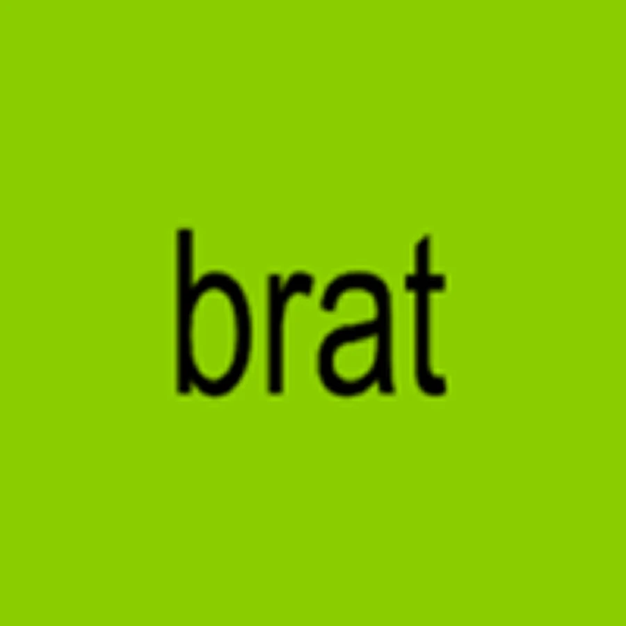
Charli XCX released brat on June 7, 2024. The cover is a lime green square with one word on it, lowercase, set in Arial, stretched slightly out of shape, and deliberately low resolution.
It won a Grammy.
Not for the music. Best Recording Package at the 2025 Grammys, credited to Charli XCX, Brent David Freaney and creative director Imogene Strauss. A flat rectangle with one word on it, up against physical packaging from people who had real materials to work with.
They went looking for a green that felt wrong
The color took five months. Freaney's studio, Special Offer, reportedly worked through around 500 shades of green before settling on one. Charli has been plain about the brief. She wanted, in her words, "an offensive, off-trend shade of green to trigger the idea of something being wrong."
Read that back. The brief was not find a green people like. It was find a green that feels like a mistake. What came out, the #8ACE00 that every copy since has standardized on, is now recognizable with no word attached to it at all.
The blur was closer to an actual mistake. NME, covering a talk Freaney gave walking through the artwork's evolution, reported that the final soft-edged cover came out of an export error involving a low resolution screenshot. They kept it.
It is too simple to copyright
Here is a detail that sounds like a technicality and is not.
Wikimedia Commons carries the brat cover as public domain, on this reasoning. "This logo image consists only of simple geometric shapes or text. It does not meet the threshold of originality needed for copyright protection."
One of the most valuable brand assets in pop music is, as a piece of authorship, legally too plain to own. What protects it is trademark, which covers use in commerce, not copyright, which covers creative expression. There was not enough expression in it to qualify.
That is the whole argument in one line. Distinctiveness and complexity are not the same thing, and most brands spend their money on the second one believing they are buying the first.
Then the label handed out the template
Here is the part most brands never get to.
Charli XCX and Atlantic Records built the brat generator themselves. A website where anyone could type anything they wanted and get it back in the cover's exact format. Atlantic's head of A&R, Brandon Davis, has credited that tool with expanding how far the album traveled.
Sit with what that is. A major label took the central brand asset of its biggest release of the year and shipped a tool to help strangers make convincing fakes of it.
Almost every brand guideline in existence is written to prevent exactly that. Do not stretch the logo. Do not alter the color. Do not set it on unapproved backgrounds. Submit usage for approval. The whole document is a list of ways you are not allowed to touch it.
brat shipped the opposite instruction, which was go ahead.
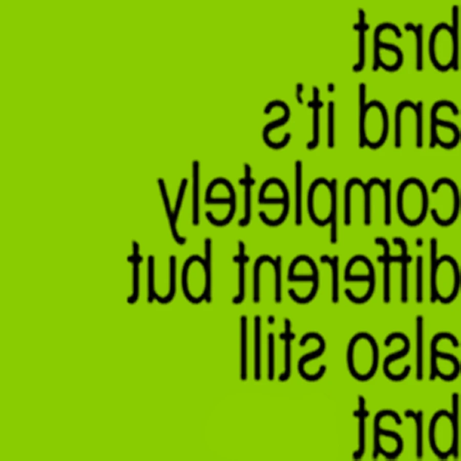
Charli ran the format herself too. The remix album arrived four months later as the same green, the same word, the same treatment, with the type flipped.
It worked, and then it got away from them
July 2024. Biden withdraws from the race and endorses Kamala Harris. Charli posts three words: "kamala IS brat".
Within days the campaign's account had renamed itself Kamala HQ and changed its banner to the cover's format. Lime ground, lowercase type, same treatment.
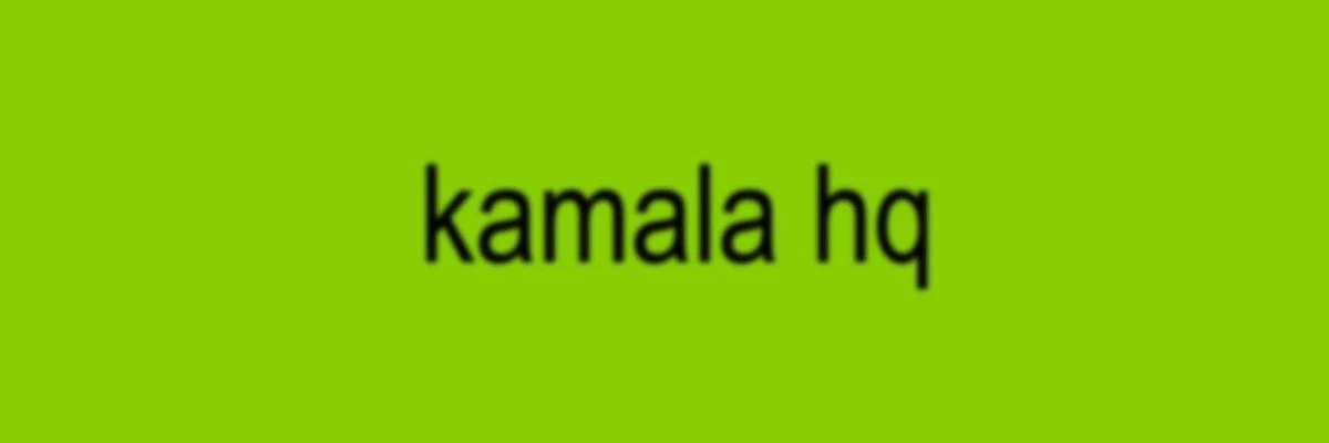
A pop album's artwork became the visual identity of a United States presidential campaign in about a week. No deal, no fee, no approval, no agency. Charli later said it had not been meant as a formal endorsement.
That November, Collins Dictionary named brat its word of the year and gave it a second definition, "characterized by a confident, independent and hedonistic attitude."
The cover did that. Not the record.
Why it survived being copied
Cover art is delivered to streaming services at 3000 by 3000 pixels. Practically nobody ever sees it that way. On a phone, in a queue, in a search result, in a playlist row, it is a small square, and that small square is what decides whether anyone presses play.
Streaming was 82 percent of US recorded music revenue in 2025, $9.47 billion of a record $11.54 billion, according to the RIAA's year end report. For the overwhelming majority of listening, the cover is a thumbnail.
brat holds at any size because there is nothing in it to lose. One flat color, one word. Shrink a photograph and it turns to mud. Shrink a flat color and it is still the color.
That is the same reason it was copyable. Anything a stranger can rebuild in thirty seconds is something that can be rebuilt at any size, on a wall, a banner, a t-shirt, a campaign account. Reproducibility and legibility are not two goals. They are one property.
And it still has to work at twelve inches
Which complicates the thumbnail argument, because the physical object is not going away.
US vinyl revenue passed $1 billion in 2025 for the first time since 1983, up 9.3 percent to $1.04 billion on 46.8 million units, the nineteenth consecutive year of growth. Luminate's year end count put vinyl at 47.9 million units, up 8.6 percent, with physical album purchases overall up 6.5 percent to 82.2 million. Taylor Swift's The Life of a Showgirl was 2025's top seller on all four physical formats, CD, vinyl, download and cassette.
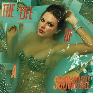
So the brief is harder than it was. The same artwork has to read at thumbnail size in a dark app and hold up as a twelve inch object somebody paid for and will stand on a shelf facing out.
brat answered both with the same move. At twelve inches it is a slab of aggressive color. At eighty pixels it is a slab of aggressive color.
A cover is positioning, and you get misread once
In June 2025, Sabrina Carpenter revealed the cover for Man's Best Friend. It showed her on her knees in a black dress, an unseen man holding her hair.
The reaction was not the one the image was reaching for. Glasgow Women's Aid, a domestic abuse charity, called the artwork regressive and took the defense apart in one line, saying that picturing herself on all fours with a man pulling her hair and calling it Man's Best Friend "isn't subversion." The conversation moved off the record entirely and onto whether the picture was satire or the thing it was supposedly satirizing.
Later that month she posted an alternate, a black and white shot of her head on a suited man's shoulder, captioned "approved by God", and sold signed copies of it on her site. The album came out on August 29, 2025.
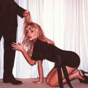
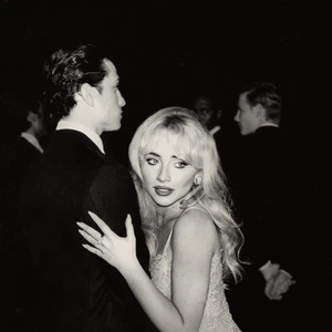
Read that as a win if you like. Plenty of people did. But look at the cost. A cover is the first argument your work makes, and it makes it before anyone has heard a note or read a line. Carpenter had to make a second one in public, in response, on terms somebody else set.
That is the risk nobody budgets for. Not that the cover gets ignored. That it gets understood as something you did not mean.
The cover was the only constant
brat was never only a cover. The campaign around it included a private burner Instagram account that let people in gradually, a wall in Greenpoint repainted through the release cycle and revealed letter by letter on a livestream, surprise pop ups, and a Boiler Room set in Brooklyn that drew 25,000 RSVPs, the largest in Boiler Room's history.
Every one of those was a different format with different constraints. The thing that made them legible as one campaign was the green. Music Ally's read on it was simple, that Charli owned a color.
That is the frame worth stealing. The cover was not artwork for a record. It was an entire brand system compressed into one square, cheap enough to apply to a wall, a banner, a post or a shirt without losing anything on the way.
What to ask about your own
Most businesses are not shipping an album. The same questions apply to a logo, a packaging refresh, an app icon, a conference booth, or anything else that has to be recognized before it is read.
Does it survive at eighty pixels? Not whether it looks good small. Whether it is still identifiably you. Shrink it on your phone before you approve it at full size on a monitor, because the small version is the one people meet first.
Could a stranger rebuild it in thirty seconds? If yes, you have something that spreads. If no, you have something that has to be distributed by you, forever, at your expense.
Is the distinctive part a color, a shape, or a photograph? Only the first two survive compression, cropping, bad printing and someone redrawing it from memory. A photograph is the most expensive thing on the page and the first thing lost.
What happens if the wrong person borrows it? A mark built to be copied will be copied by people you did not pick. Charli got a presidential campaign out of it. Decide in advance which borrowings you would live with, because you will not be asked.
What does it argue before anyone reads a word? Every cover takes a position. The only question is whether you chose it.
Five months and roughly 500 greens went into a call most people would make in an afternoon from a dropdown. What came out was one rectangle, one word, no photograph, nothing to admire up close. Then the label gave the format away so other people could make their own.
Those are not two decisions. They are the same one, which is to build the smallest, loudest, most reproducible thing you can and then get out of its way.
Most brands do the reverse. They spend the five months on something nobody can redraw, and then write the rules that stop anyone from trying.